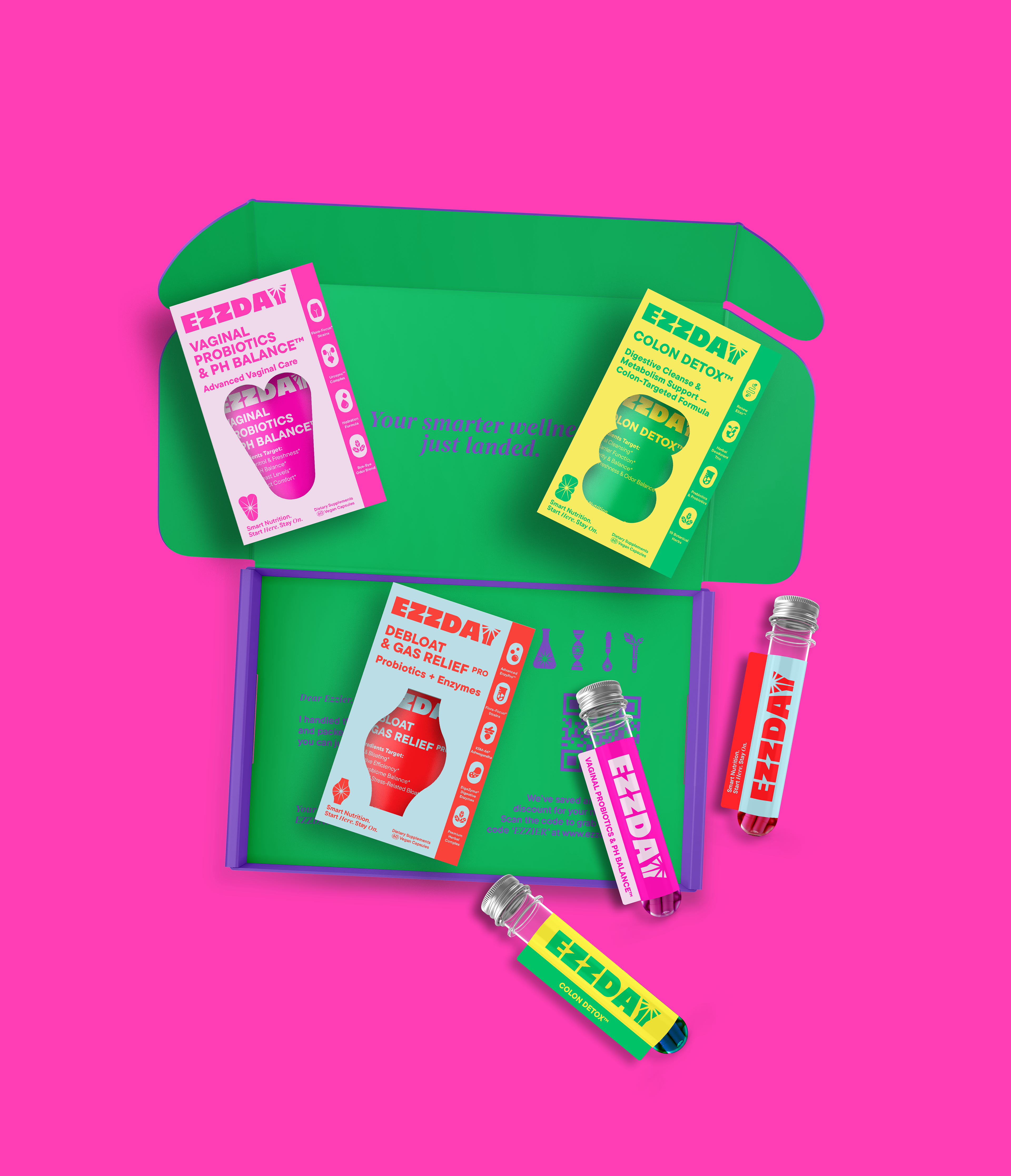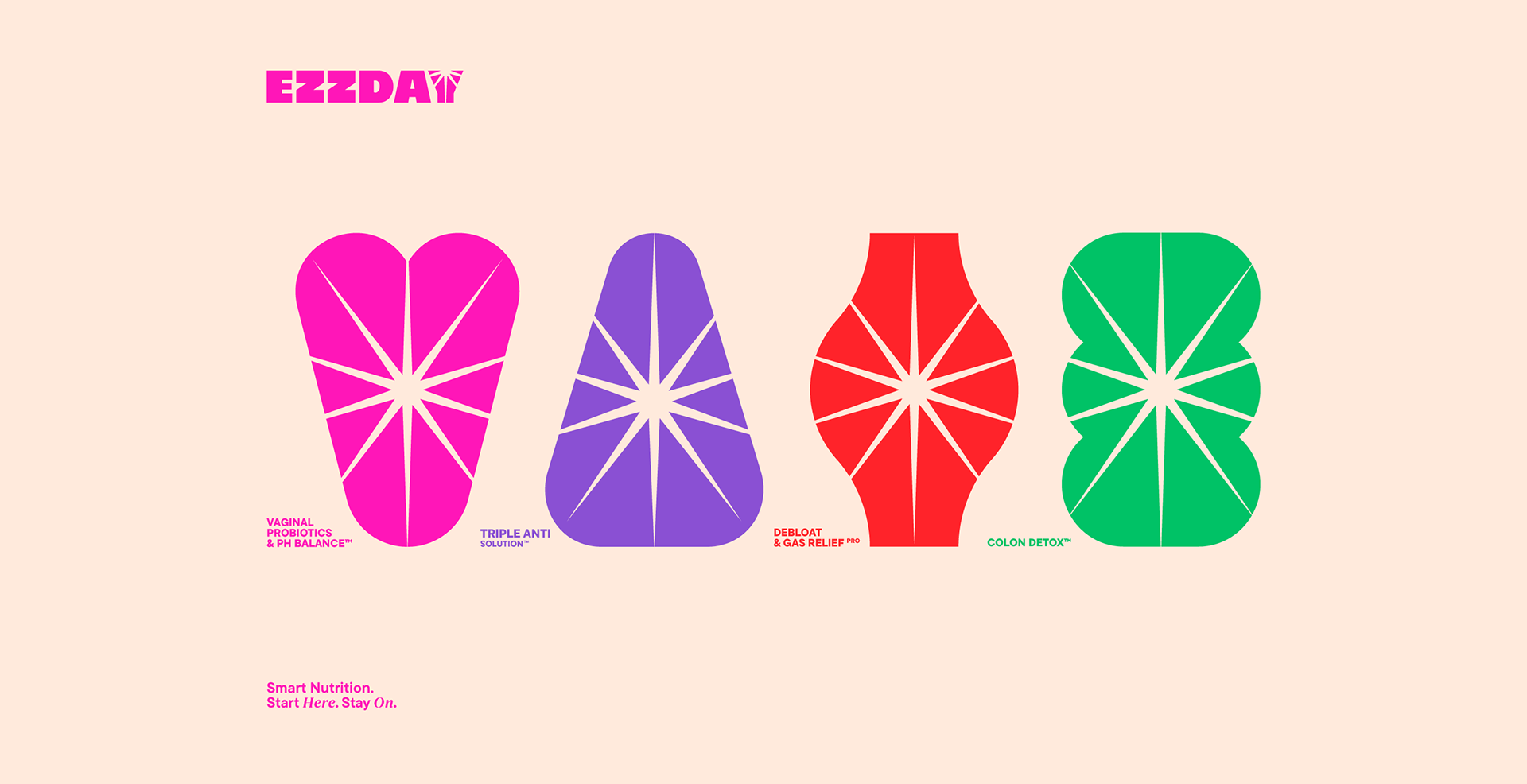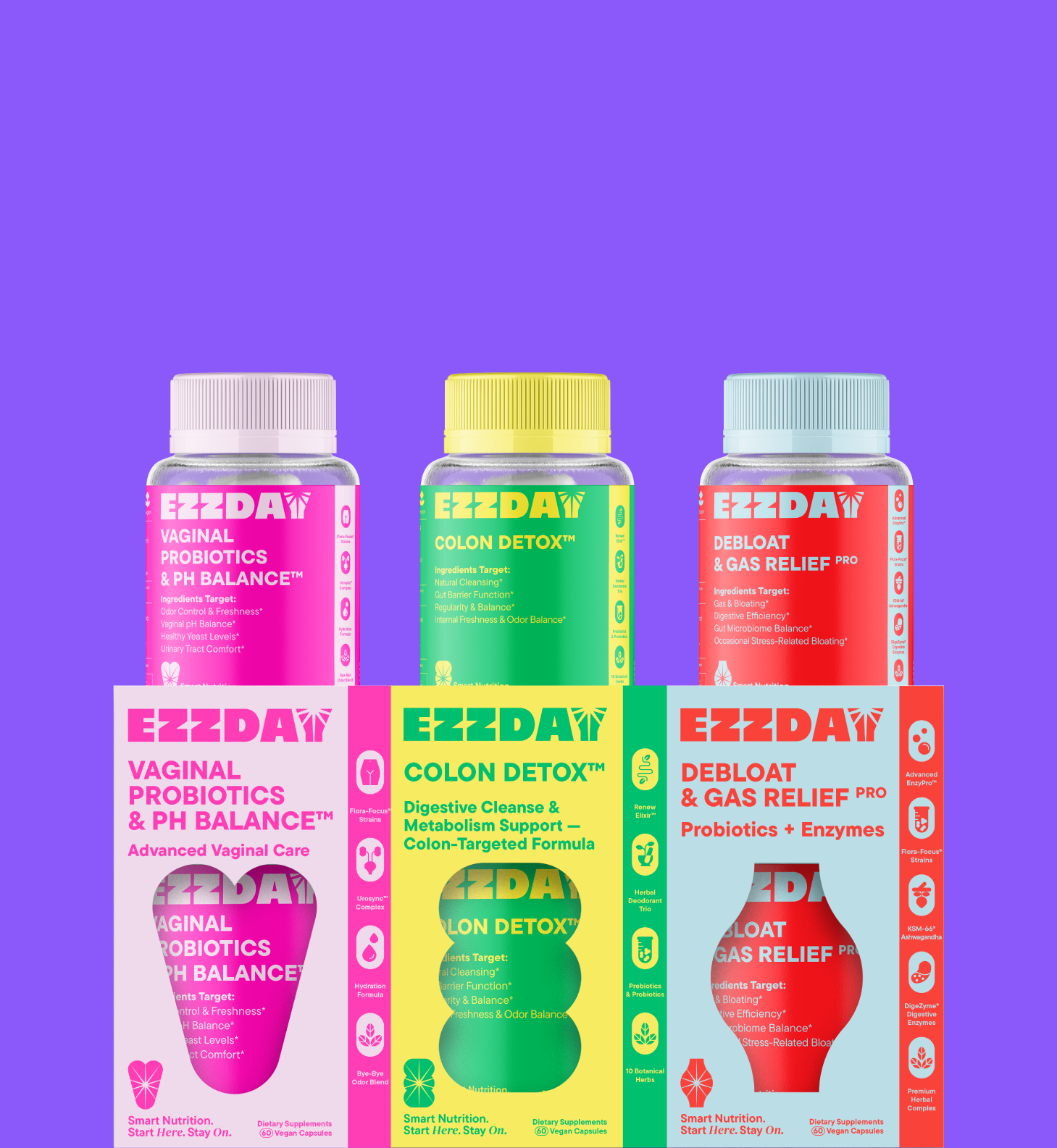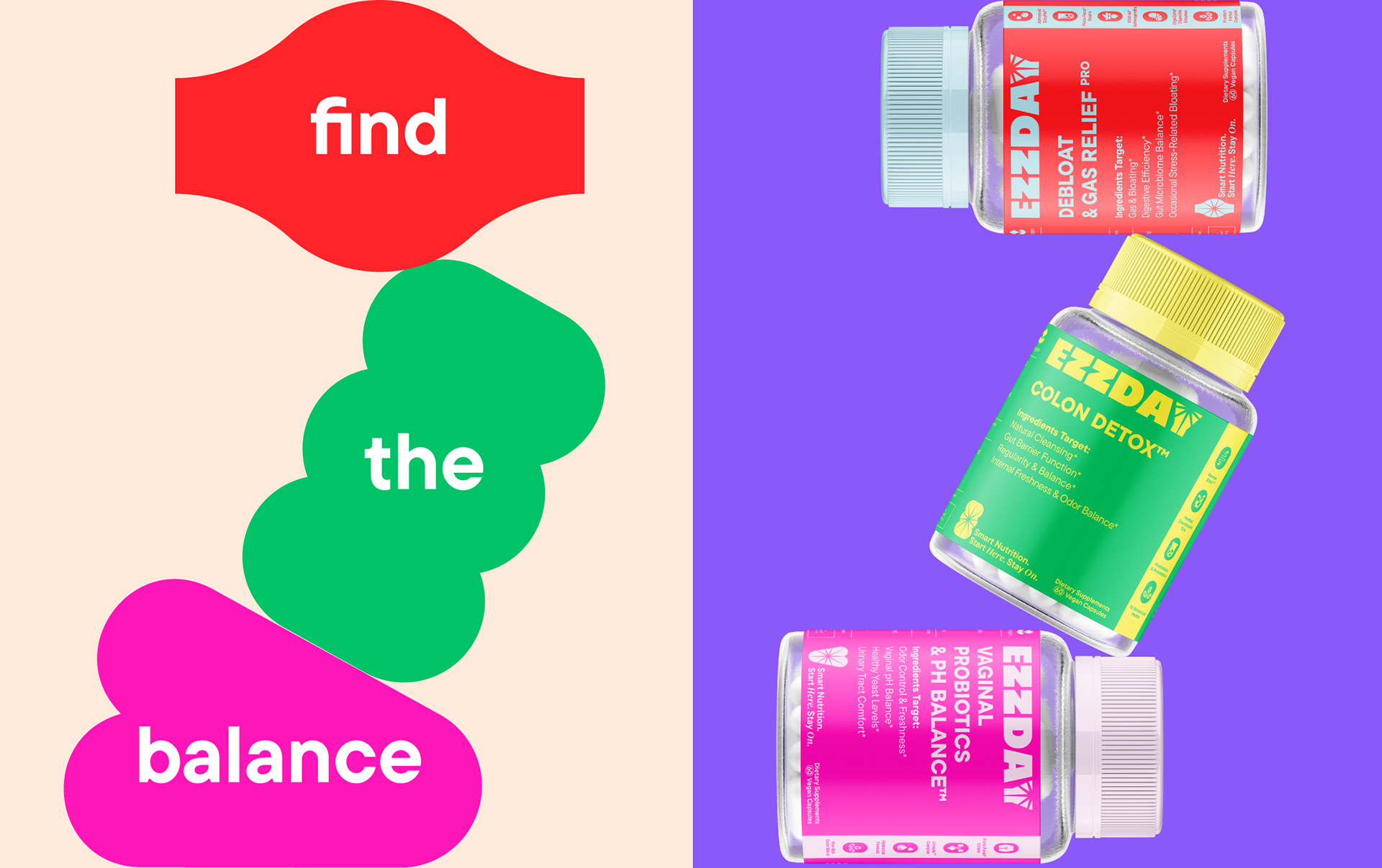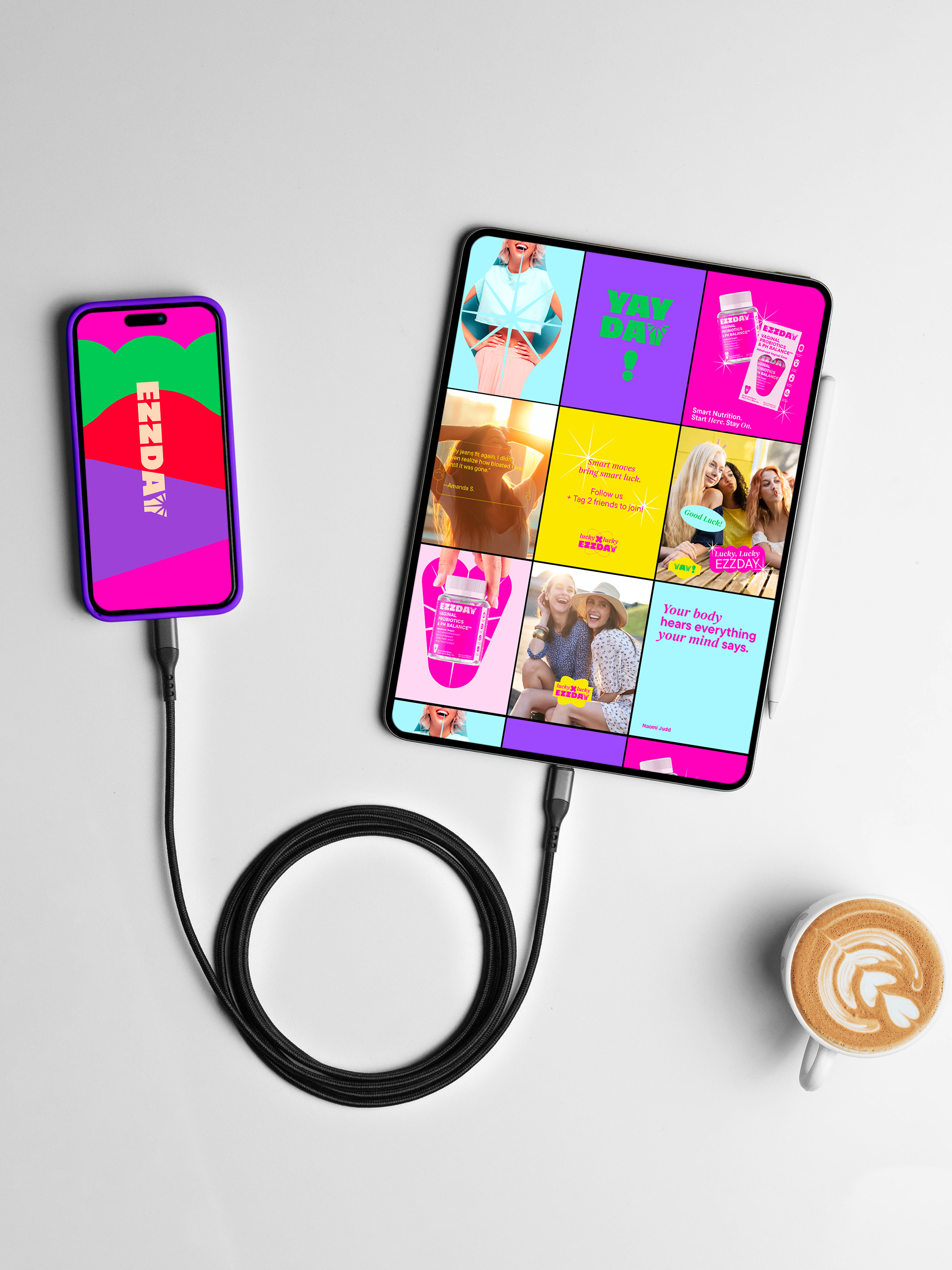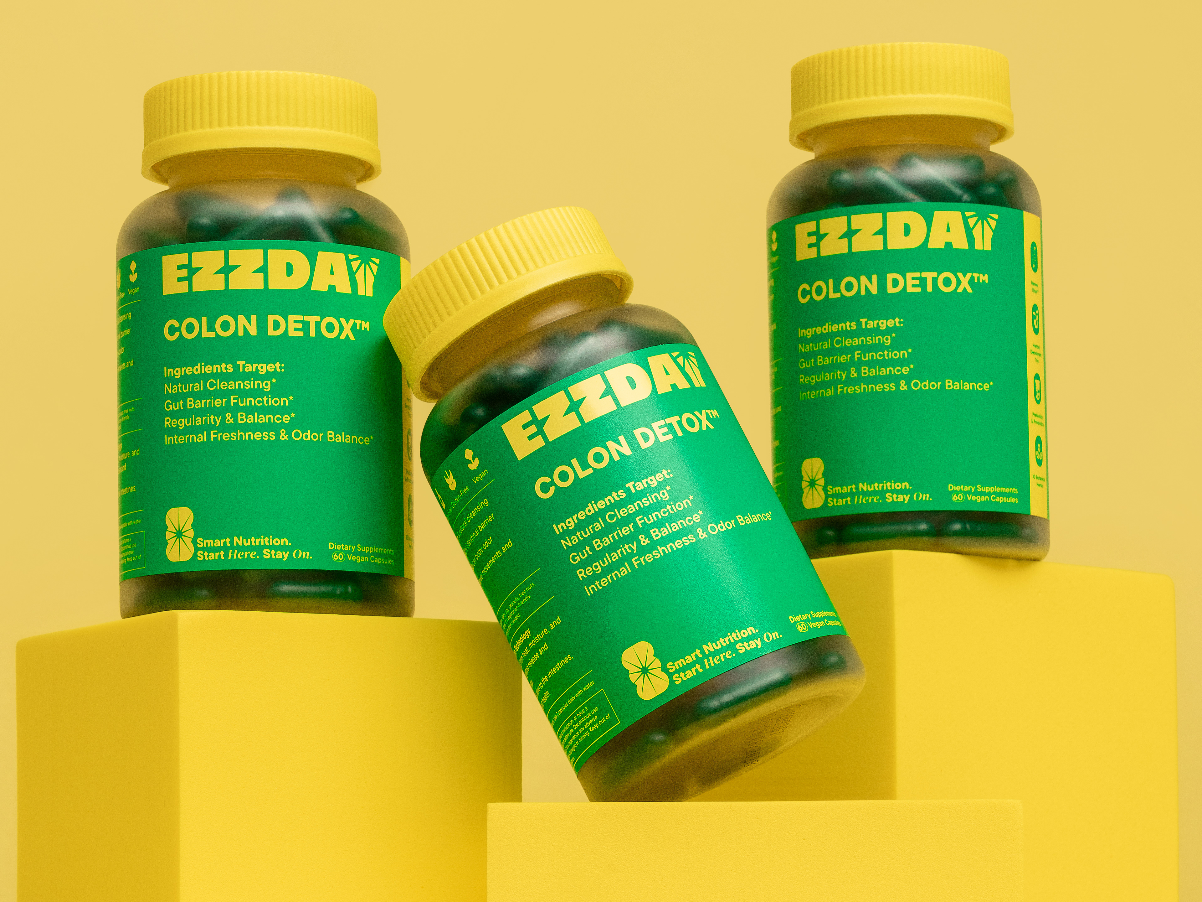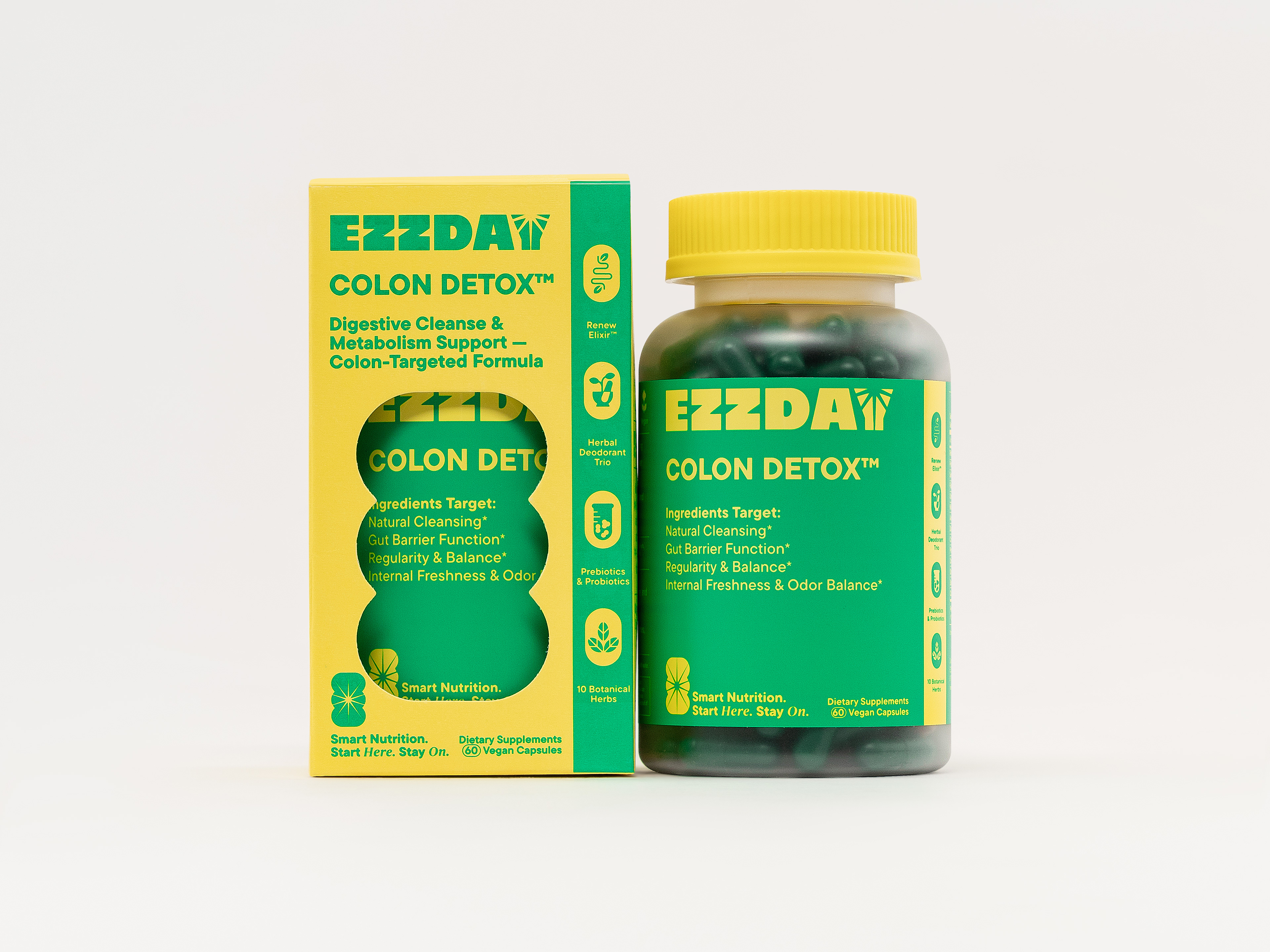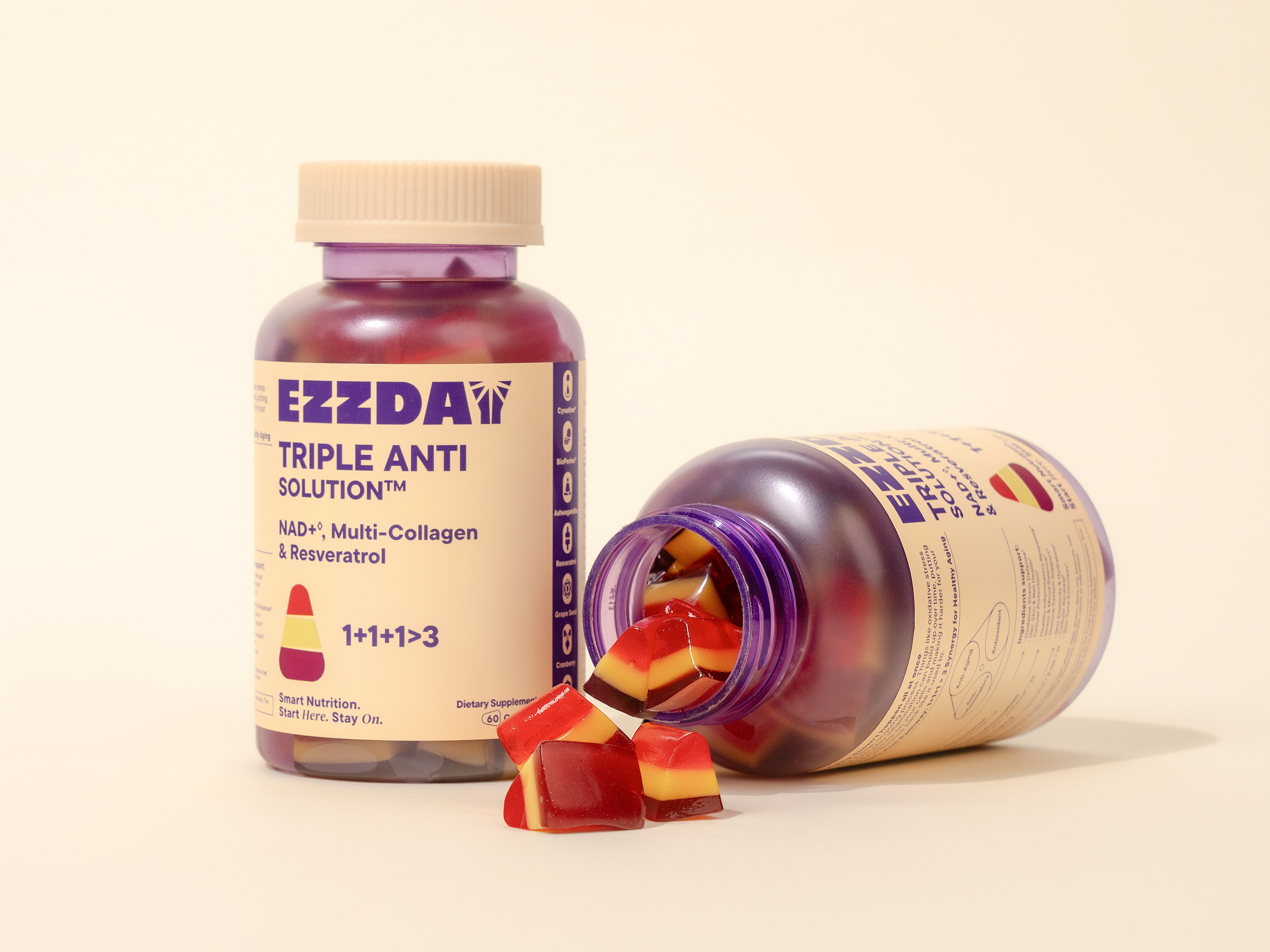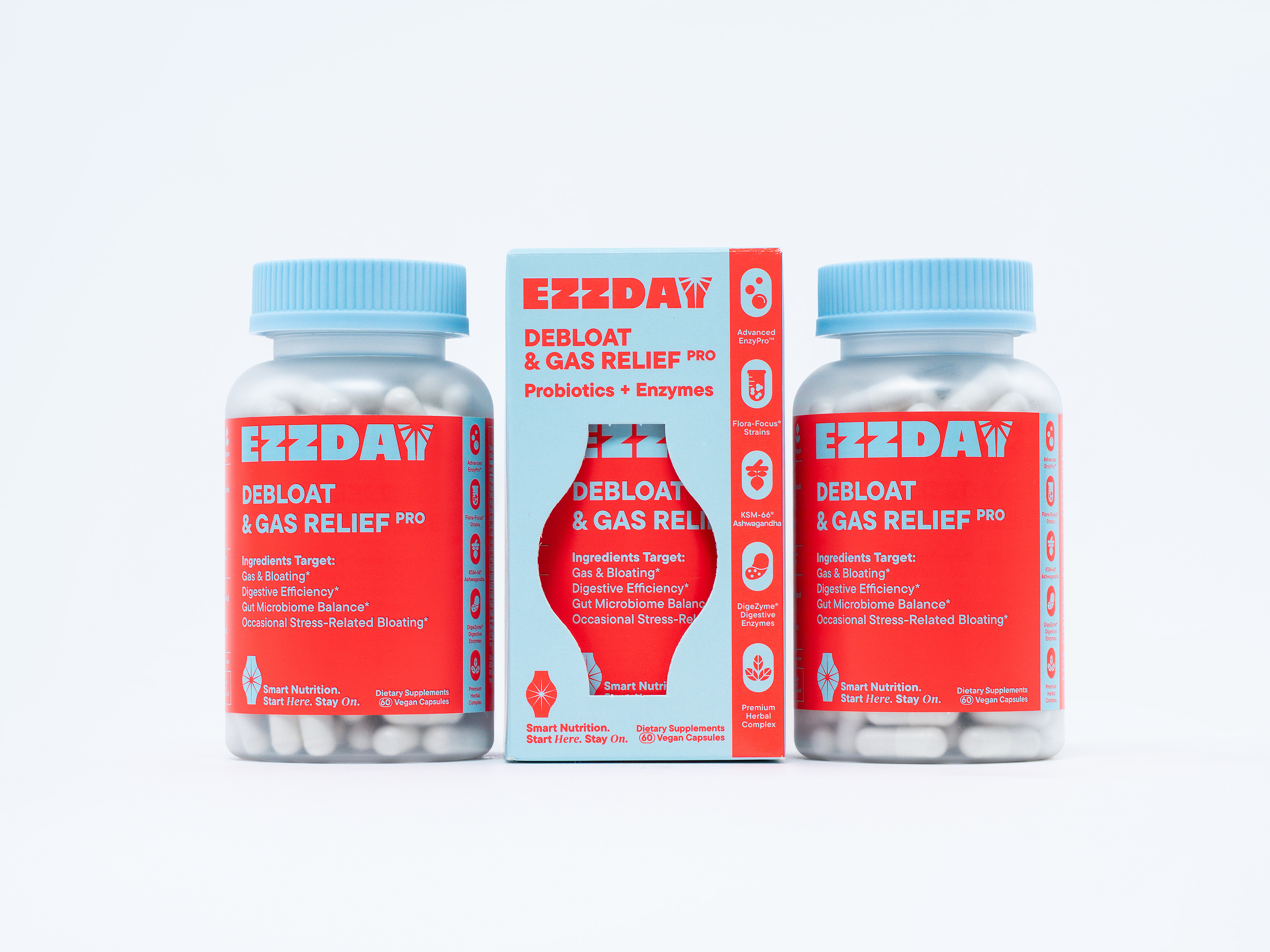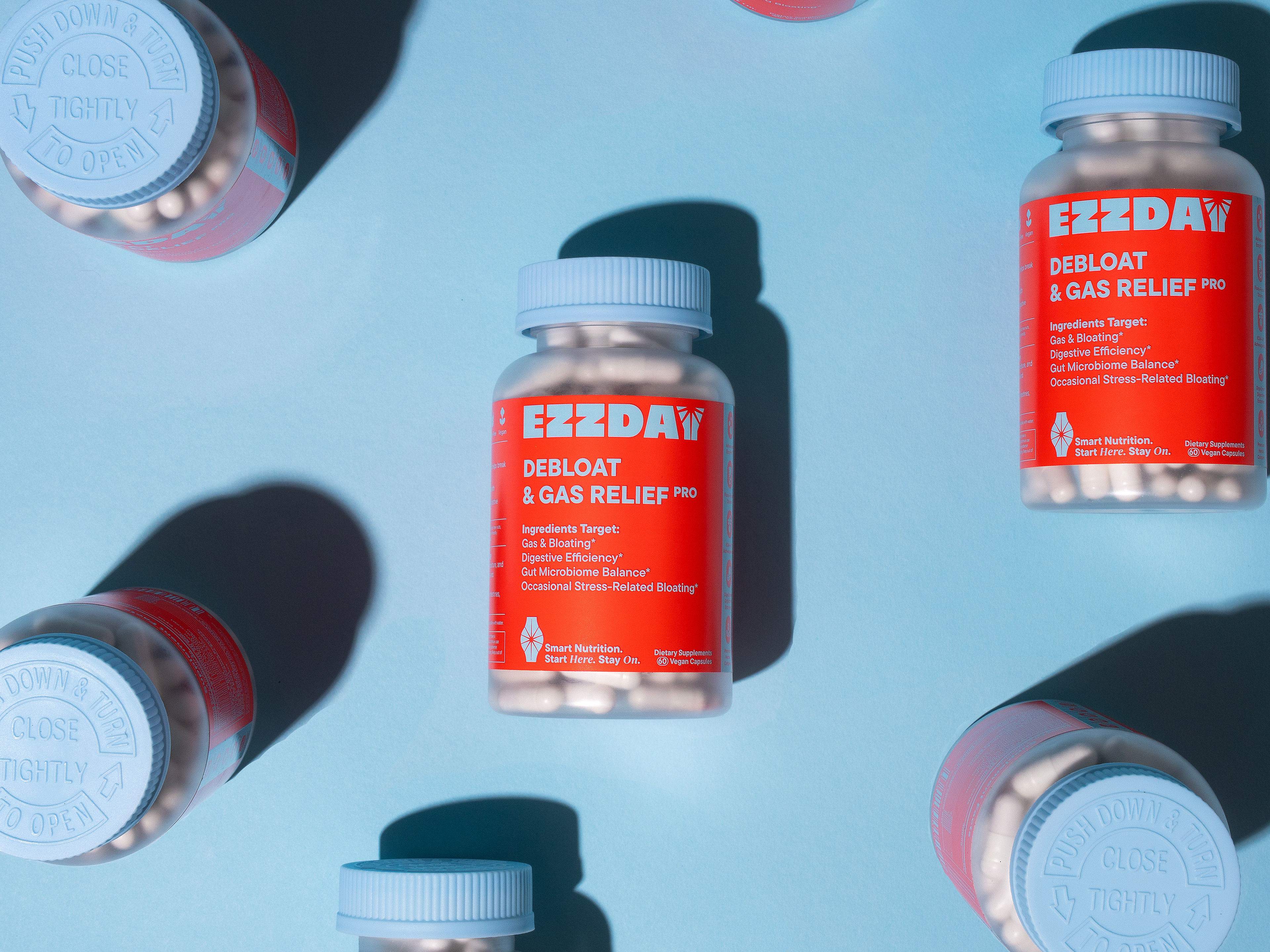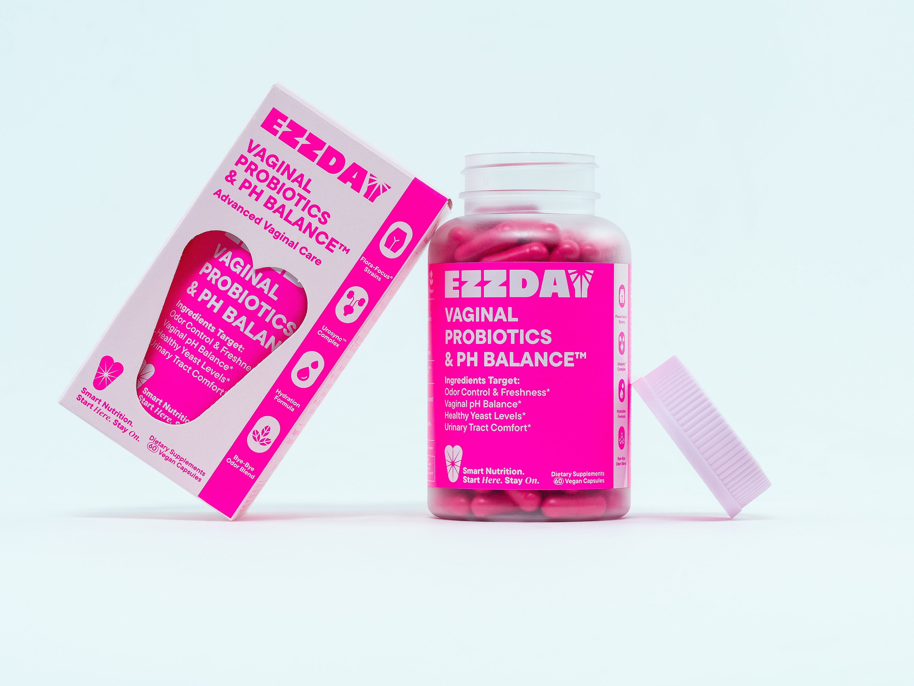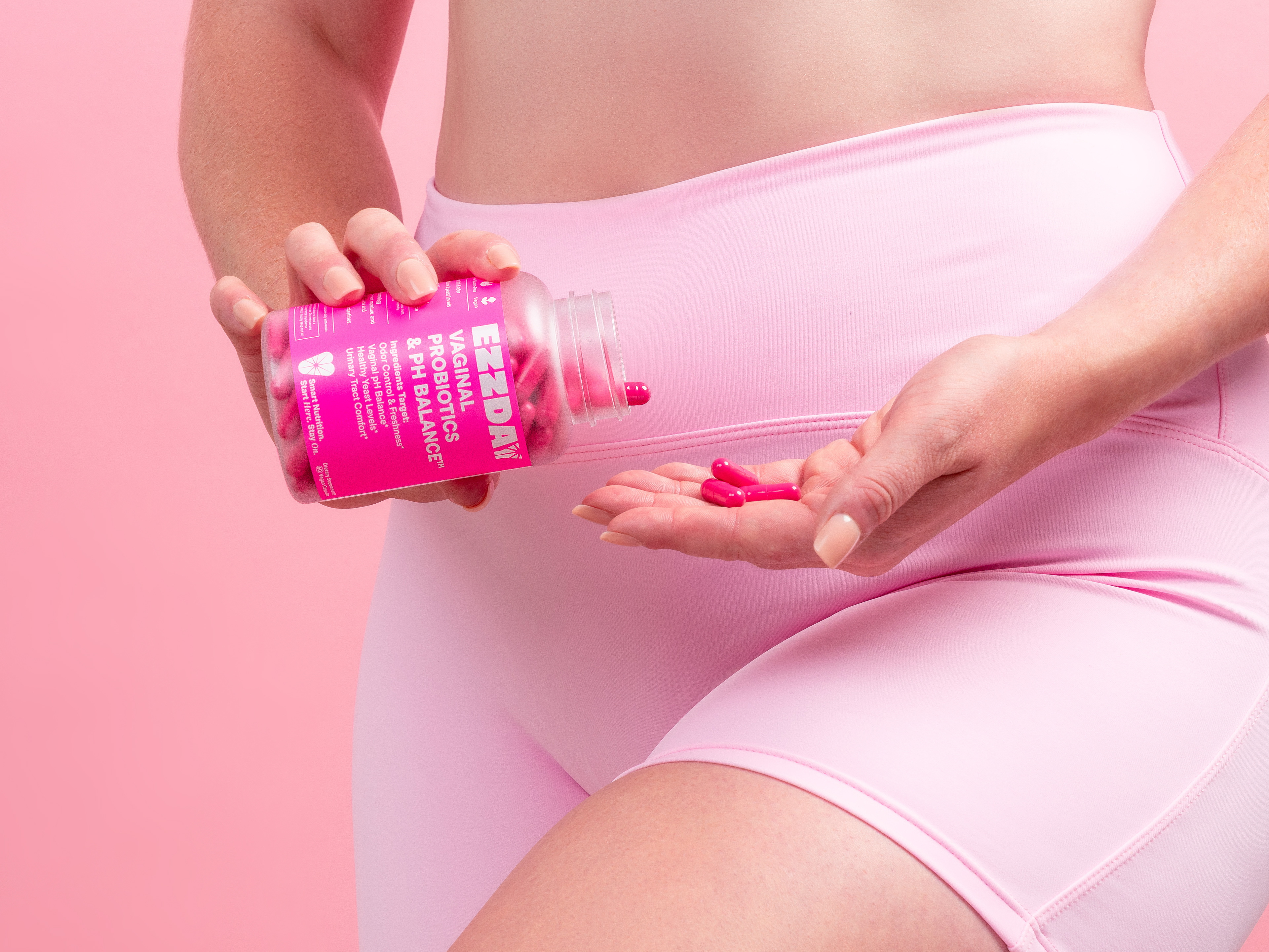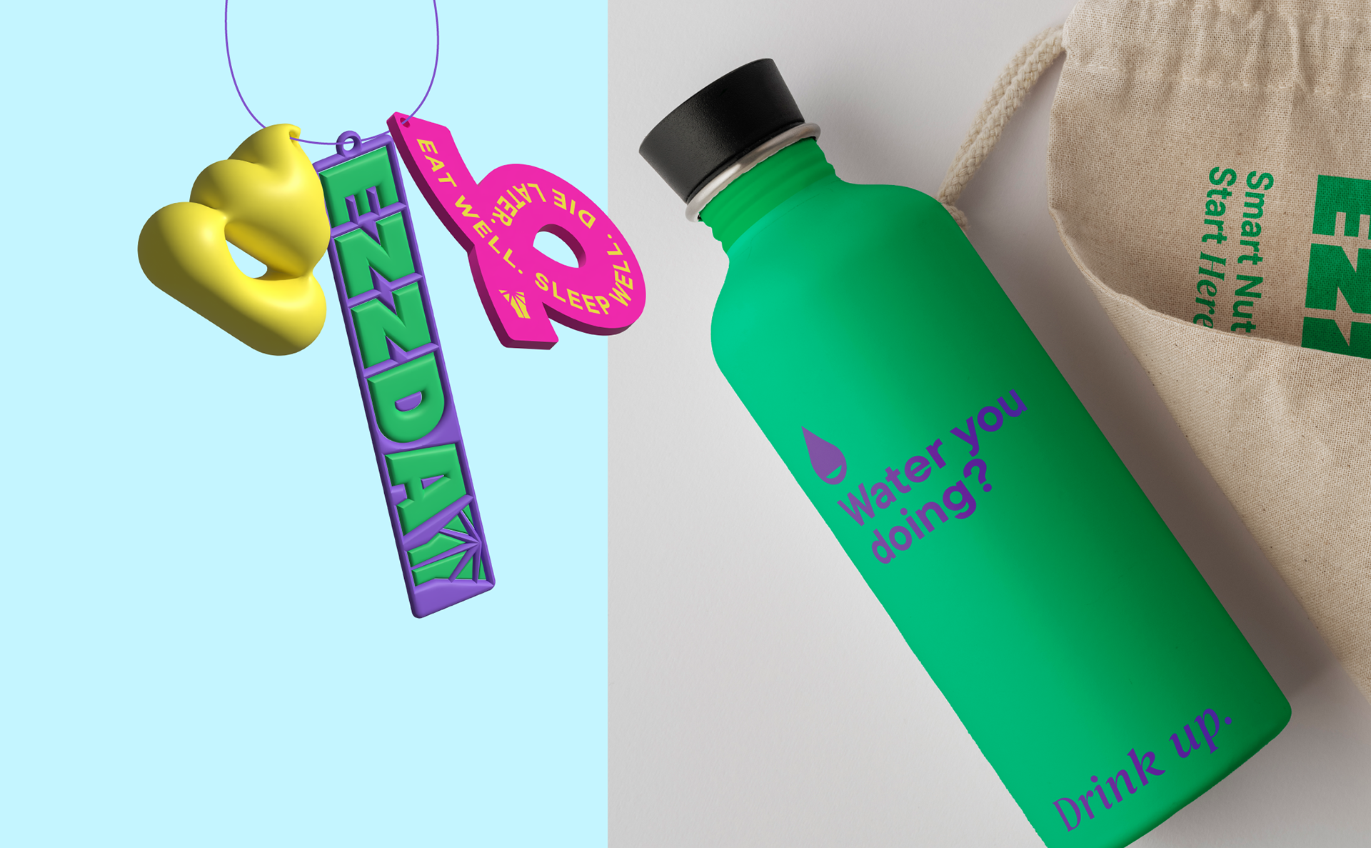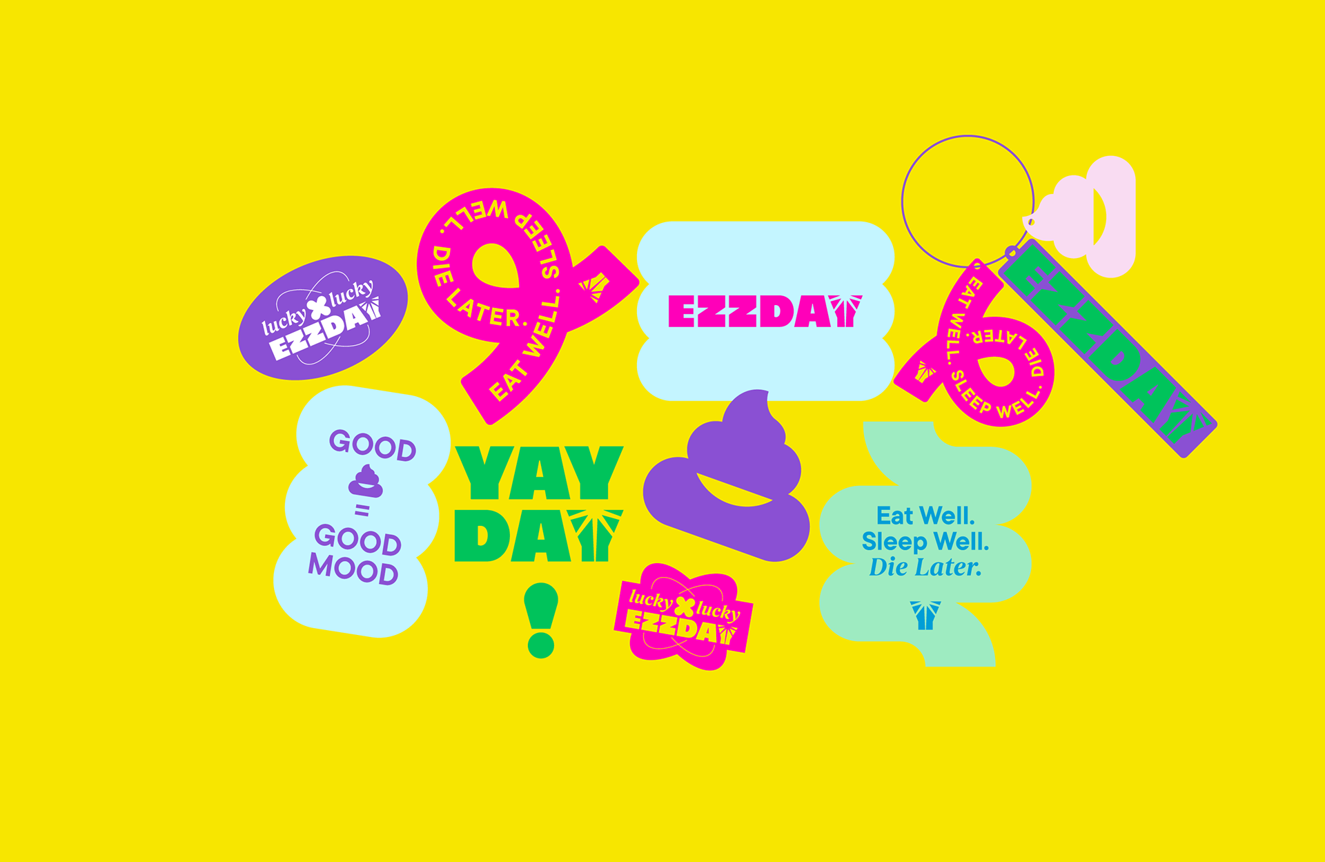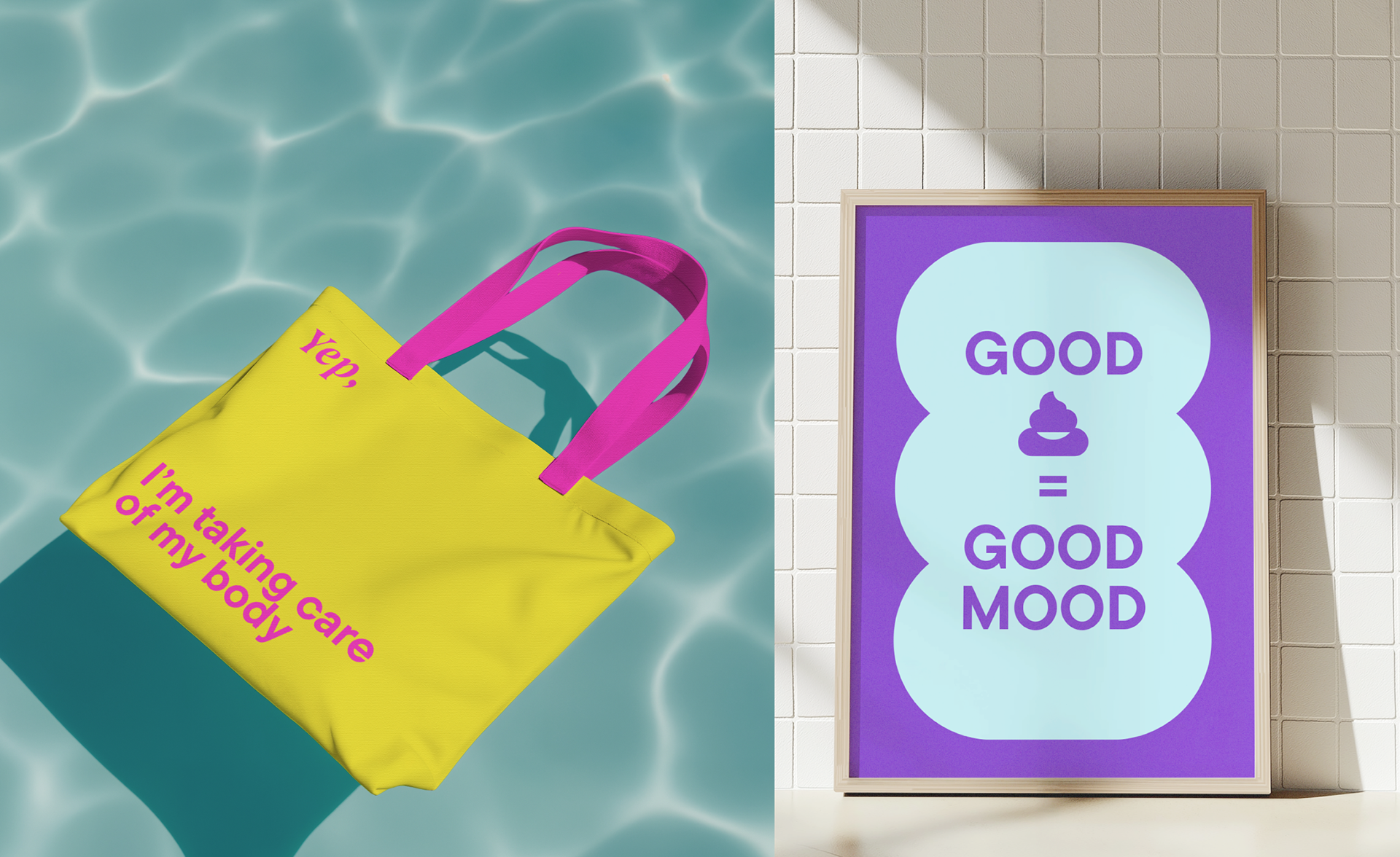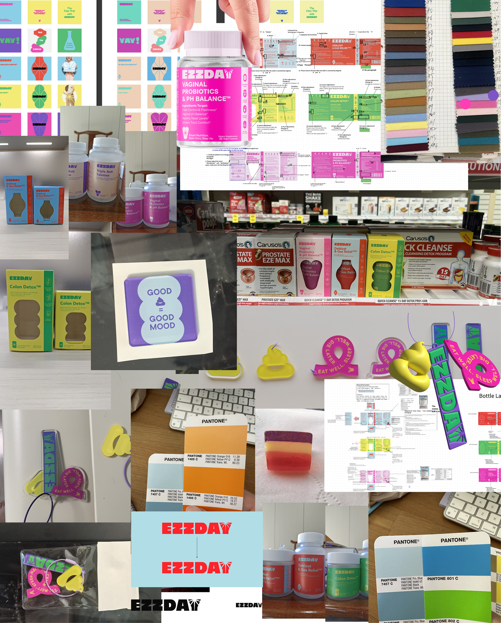

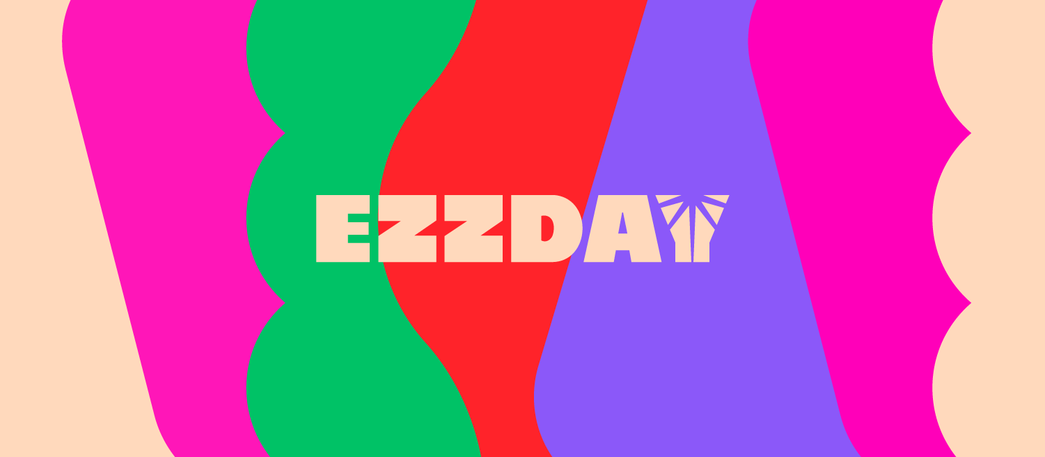
The branding concept for EZZDAY was to create a simple, distinctive identity that wouldn’t feel overwhelming or overly scientific—something that resonates with the modern woman. Every day begins with the sunrise, and that first ray of light became the inspiration behind the logo and the geometric shapes representing key features of EZZDAY’s products.
I built the entire brand—from the logo and packaging to social media and marketing materials—around bold, joyful colors and clean, minimal forms. EZZDAY isn’t just about pretty packaging; the goal is to shape an entire lifestyle. By keeping the design solutions simple and scalable, the brand has the flexibility to grow and evolve with new products in the future.